"Approval's in the mail," we were told by Council on Tuesday, who took over two weeks just to "finalise the paperwork." Of course though, when our builder called them this morning, they hadn't sent it at all. So our builder personally went to pick it up today...and it STILL wasn't ready and he had to wait. Poor Daniel.
But folks, WE HAVE IT! Finally!
Now, the site cut is scheduled for some time over the coming weeks, and one month from then we should have a slab.
Time for one last look over the plans...
Friday, May 25, 2012

Tuesday, May 22, 2012
Final Colour Selection and Stair Update
We have made our final colour selection, so there's no going back now...
One thing I've noticed from my failed Google search to find stairs that look like ours is that American's have lovely staircases. Even the most basic ones have lovely, dark hardwood treads and detailed balustrading...*sigh*
All Wattyl Paint Colours-
Main wall colour: Natural Angora (B300-A)
Ceiling/skirting/doors/trim: Wattyl White (E070-A)
Formal Living & Dining feature wall: Hunter
Grape (B080-G)
Hallway niche: Hunter Grape (B080-G)
Family Room feature wall: Hunter Grape (B080-G)
Study feature wall: Citadel Blue (C200-D)
TV Room feature wall: Hunter Grape (B080-G)
Main Bedroom feature wall: Eternal Dark (C320-D)


Highlighted below are the locations of the feature walls:


All I can say is that we had better love Hunter Grape! Though having said that, it will be muted by mostly light finishes and people won't be facing it all the time. We hope that the overall effect will be bold and warm.
Also, we have finalised the stair case (of course this is having not realised that it needing finalising until yesterday!).
After immediately discounting a solid timber staircase simply for the cost of it, we have opted for a bullnose timber tread for the first step (this will look good and wear better than carpet), with standard carpeted MDF for the remainder. We have also requested that the first four stairs be open plan i.e. starting the balustrading from step five. We're also getting a solid maple handrail, as opposed to pine, so that it will be a dark colour to match the front door, floor boards and first step. Lastly, we're getting stainless steel balustrading.
One thing I've noticed from my failed Google search to find stairs that look like ours is that American's have lovely staircases. Even the most basic ones have lovely, dark hardwood treads and detailed balustrading...*sigh*
Saturday, May 19, 2012
Colour me Mine
Ahhhh, the decision I've been simultaniuosly looking forward to and dreading...paint colours.
Mick and I are an interesting pair when it comes to colour. I LOVE colour, especially bold colour and Mick...well, he's pretty much as colour-blind as you can get, and I mean that literally. He can't distinguish between red and green, can seldom see red (though interestingly he is attracted to it, which confused me no end in the beginning of the relationship when he said his favourite colour was green but he would choose red things!), and when I ask him to describe a colour, he usually answers, "dark?" So, you can understand my stress? Luckily we came to an agreement fairly early on that, as long as Mick didn't perceive the colour as heinous, I could pick what I like.
Now, my favourite colour is purple and left to my own devices I would probably put it everywhere. My next favourite is black (though not a colour technically), then red. I do not like green or brown, and whilst I can appreciate a neutral, white or pastel colour scheme (especially with pops of timber, black or bold colour), I would not paint them myself (much like lovers of those schemes probably would avoid my choices).
It all started with a clear vision for the formal living space... I have been unable to find an image that encapsulates exactly what I want to do but I've always felt strongly that I want the first impression upon opening the stained wooden door to be of dark floor boards in the entry and hallway, light creamy carpet (possibly with a pattern) through the main body of the living area, creamy/parchment wall colour through the hallway and most walls and a bold, deep, purple/red/taupe main wall colour framed by white skirting and architraving. I love the idea of a rich, warm, regal purple/red/taupe muted by lots of cream (not too dark or yellow) with timber accents and a shot of greenery through large windows. Here are a few images that inspire me (I've tried to give sources for images where possible, but some of these images are from my ancient web trawls before this blog existed):


The Media Room is the tough one. I think we're going to attempt to carry-through the grape feature colour and hope that it plays nice with Mick's chocolate-brown, sued lounge...If not, it's only paint...right?
I can't remember exactly how the concept for the Study started (possibly from a Rawson brochure from way back when we first bought the block), but we want that to be a masculine space so we've chosen a blue feature wall colour and will accent it with (and this part we're not entirely sure-on yet) either chunky white or black furniture. At this time, we plan on having a long computer desk, which can accommodate two computers, floating shelves, a small sofa-bed and floor lamp. Here is my inspiration:
Then we have upstairs. With no set occupants for most of the rooms, we're leaving those cream. We've decided to paint a feature wall in the TV Room and Master Bedroom, so that when you're sitting in one (with all the double-doors open), you can see the other, and when you come up the stairs you can look straight ahead at the view of the golf course, or see colour to the left and right. We' will also stain the stair balustrade the same colour as the floor-boards to carry the timber upstairs.
So, the TV Room wall colour will be the same rich grape as downstairs and the Master Bedroom will have a black feature wall that wraps around the "floating wall" that separates the wardrobe from the room. This will mirror the black and white scheme in the Ensuite (as I have posted earlier).
Here is some black and white (or cream) inspiration:
So, our scheme is bold colour (black, blue, grape) layered on linen/cream framed in white with timber accents.
Here's hoping it works!
Mick and I are an interesting pair when it comes to colour. I LOVE colour, especially bold colour and Mick...well, he's pretty much as colour-blind as you can get, and I mean that literally. He can't distinguish between red and green, can seldom see red (though interestingly he is attracted to it, which confused me no end in the beginning of the relationship when he said his favourite colour was green but he would choose red things!), and when I ask him to describe a colour, he usually answers, "dark?" So, you can understand my stress? Luckily we came to an agreement fairly early on that, as long as Mick didn't perceive the colour as heinous, I could pick what I like.
Now, my favourite colour is purple and left to my own devices I would probably put it everywhere. My next favourite is black (though not a colour technically), then red. I do not like green or brown, and whilst I can appreciate a neutral, white or pastel colour scheme (especially with pops of timber, black or bold colour), I would not paint them myself (much like lovers of those schemes probably would avoid my choices).
It all started with a clear vision for the formal living space... I have been unable to find an image that encapsulates exactly what I want to do but I've always felt strongly that I want the first impression upon opening the stained wooden door to be of dark floor boards in the entry and hallway, light creamy carpet (possibly with a pattern) through the main body of the living area, creamy/parchment wall colour through the hallway and most walls and a bold, deep, purple/red/taupe main wall colour framed by white skirting and architraving. I love the idea of a rich, warm, regal purple/red/taupe muted by lots of cream (not too dark or yellow) with timber accents and a shot of greenery through large windows. Here are a few images that inspire me (I've tried to give sources for images where possible, but some of these images are from my ancient web trawls before this blog existed):


 |
| Smart Strand IQ150 Carpet |
 |
| Feature Wall Colour - Wattyl Hunter Grape |
 |
| Main Wall Colour - Wattyl Natural Angora |
 |
| Skirting/Trim/Ceiling Colour - Wattyl White |
Now, the kitchen/meals (as I have covered earlier) I envision being white with timber accents and a pop of aubergine/grape and black (through appliances and crockery). I also want glass to feature and both Mick and I want a large, long, rustic timber dining table (likely about 3m long). It will be our only eating space and we want it to be large and inviting. Here's one we like at the moment (if only we had somewhere to store it):

The Media Room is the tough one. I think we're going to attempt to carry-through the grape feature colour and hope that it plays nice with Mick's chocolate-brown, sued lounge...If not, it's only paint...right?
I can't remember exactly how the concept for the Study started (possibly from a Rawson brochure from way back when we first bought the block), but we want that to be a masculine space so we've chosen a blue feature wall colour and will accent it with (and this part we're not entirely sure-on yet) either chunky white or black furniture. At this time, we plan on having a long computer desk, which can accommodate two computers, floating shelves, a small sofa-bed and floor lamp. Here is my inspiration:
 |
| House to Home UK |
 |
| Ikea |
 |
| All Things Lovely |
 |
| Wattyl Citadel Blue |
Then we have upstairs. With no set occupants for most of the rooms, we're leaving those cream. We've decided to paint a feature wall in the TV Room and Master Bedroom, so that when you're sitting in one (with all the double-doors open), you can see the other, and when you come up the stairs you can look straight ahead at the view of the golf course, or see colour to the left and right. We' will also stain the stair balustrade the same colour as the floor-boards to carry the timber upstairs.
So, the TV Room wall colour will be the same rich grape as downstairs and the Master Bedroom will have a black feature wall that wraps around the "floating wall" that separates the wardrobe from the room. This will mirror the black and white scheme in the Ensuite (as I have posted earlier).
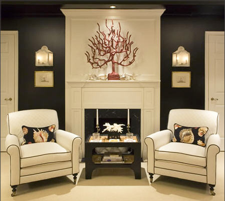
Here is some black and white (or cream) inspiration:
 |
| Home and Decor |
 |
| Belle Maison |
 |
| Belle Maison |
 |
| Wattyl Eternal Dark |
So, our scheme is bold colour (black, blue, grape) layered on linen/cream framed in white with timber accents.
Here's hoping it works!
Sunday, May 13, 2012
Will We Ever Have a House..?
So, today marked the sad realisation that we won’t be in by
Christmas.
I’m beginning to doubt that Council will ever approve our plans, and so understandably
we’ve nearly run out of passion for the build. But, backed by the logical
conclusion that one day we will have
our house, we have made some changes to the bathroom selections purely to save
some money. It’s always a difficult balancing act between what you need, what
you want, what you can afford, what is good for re-sale, what will last etc.
We’ve made the big decision to get rid of the spa bath and
simply have the bath version of the same tub. It’s still built for two with the
waste in the middle and sloped sides, but it’s significantly cheaper. When we really
thought about it, it’s unlikely we would use the spa much, it doesn’t really add
to re-sale and they aren’t ideal for small kidlets which we, or future owners,
may one day have. We’ve also gone with standard sink mixers and towel rails,
removed some robe hooks and picked a more simple/cheap vanity in the Main
Bathroom. These are all things we can upgrade later if we want. We’re leaving
most of the upgrades in the Ensuite however.
A few more cost-saving choices we’ve made are to install our
own flooring, data-cabling, extra joinery i.e. Laundry, wardrobes, garage etc.
We’re also planning on doing a lot of the landscaping ourselves and we’ve gone
with the sheen finish for the kitchen. It’s still an upgrade, but it’s
considerably less than the gloss.
*sigh* So, shall we start taking bets on if/when we get
approval..? It’s all apparently approved in principal and should have been
rubber-stamped as soon as Council had the new survey and plans….that was
several weeks ago...
Monday, April 16, 2012
Bathroom Selections and Mood Boards
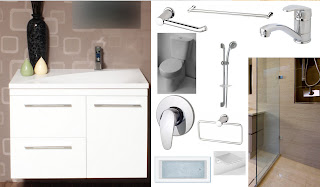
So...we're still waiting for Council, and in the vain hope that one day our house might actually get built, we have made the following bathroom selections, complete with mood boards and layouts:


Main Bathroom


.jpg)

Powder Room
Toilet: Valero Short Projection Wall Faced Toilet Suite

Basin mixer: Phoenix Ivy basin mixer (YV770 CHR)
Hand Towel Rail: Phoenix Gen Y Guest Towel Rail (GY893 CHR)
Hand Towel Rail: Phoenix Gen Y Guest Towel Rail (GY893 CHR)

Here are some photos (apologies that the sources are long forgotten) of bathrooms tiled in the sort of tile we want for the Powder Room, Laundry and Main Bathroom:

.jpg)

We'll have floor-to-ceiling tiling (as in these photos) for the Main Bathroom and skirting for the Powder Room and Laundry.
Ensuite
Toilet:


The mosaic will be used on the entire shower wall opposite the door. It should make a glorious, shimmery feature. The rest of the walls will be floor-to-ceiling white gloss tile and the floor and shower bench will be in a matt black tile. We hope to mirror the black and white colour scheme in the Master Bedroom.
An interesting thing to note is that we've opted for a single-bowl, 1200mm vanity in order to have a larger, heated towel rail...We hope this doesn't effect re-sale, but really the only time you need two sinks is if you want to brush your teeth at the same time.
Kitchen:
Laundry:
Hand towel rail: Phoenix Gen Y Guest Towel Holder (GY893 CHR)
The laundry mood board is a work in progress. I have it in my head though, so stay tuned!
Any thoughts/comments on our selections are always welcome. Goodness knows we need something to distract from the tedious wait for Council!
The laundry mood board is a work in progress. I have it in my head though, so stay tuned!
Any thoughts/comments on our selections are always welcome. Goodness knows we need something to distract from the tedious wait for Council!
Wednesday, April 4, 2012
The Kitchen!
Ok, it has been a long time in the making but here are our finalised kitchen plans:


Note: The 3D image on the second page denotes a lower oven position and different drawer configuration below it. This was one of the changes we had fixed, but alas the pic wasn't updated. We will just note that it is incorrect in that image for purposes of sign-off. The rest of the plans show the right configuration.
Colour and appliance selections:
Benchtop: 40mm Caesarstone White Shimmer
Splashback: Caesarstone White Shimmer

Cupboards: Polytec Sheen Classic White (Yes, there is actually a picture underneath this text!)

Under-bench cupboard handles: Recessed aluminium


Pantry and microwave cupboard handles:

Microwave cupboard door: Aventos lift system

Pendant lights above the island:

Floor: Spotted Gum timber floor boards

Sink:

Tap: Phoenix Vivid Sink Mixer 220mm Gooseneck

Oven: SMEG SAP112-8

Cooktop: SMEG PSA906 GAS

Rangehood: SMEG K9399R

Dishwasher: SMEG DWAI152XT SEMI-INTEGRATED

Fridge: LG GR-L219CSL
http://www.lg.com/au/kitchen-appliances/refrigerators/LG-french-door-refrigerator-GR-L219CSL.jsp

A lot of planning has gone into this kitchen and how we will use/enjoy the space. Here is an overview of some of our choices:
- There are a lot of drawers as they are the best use of space and are easier for lifting things out of
- The recessed aluminium handles are easy on our hands and look great
- The oven and microwave positions are high
- We couldn't justify the price and inconvenience of an integrated microwave (the fascia's cost more than the appliance and aren't universal!) but we wanted a seamless look without having the microwave low-down i.e. hidden in the island. So, we decided on a microwave cupboard which allows us to save money, by using our old microwave, without compromising the look of the kitchen. We also opted for a commercial-grade door on the cupboard so that it can be larger and keep symmetry, as well as have an extra shelf for microwave covers/containers etc.
- We wanted our splashback to be Caesarstone like the bench-tops however Caesarstone is 20mm thick (glass is 6mm), so we've extended the cooktop wall by 3cm (maximum we can go without having to start doing expensive things like change cupboard depths).
- Wine rack next to fridge. Always handy.
- We will install our own bin after hand-over as well as this pantry system:

- A lot of time was spent agonising over the cupboard material and finish i.e. gloss vs sheen vs matt and createc vs melamine vs vinyl vs polyurethane. In the end we decided on a compromise and went with Polytec Sheen. This was for a number of reasons. We decided on the melamine because it appears to be the most hard-wearing (based on opinions gathered from the web as well as from our kitchen designer) and Sheen (which is like a semi-gloss) because it has the easy-wipe 'cleanability' of gloss without the huge price-tag. Also, hopefully it won't show as many finger prints as the high gloss, nor should it blind us considering the two skylights that will be angled towards our kitchen!
- And, my most favourite thing in the kitchen...the bookshelf! The perfect segue into the Study and a great way to store my myriad of cookbooks and Donna Hay magazines!!!!!! (Can you tell I'm excited?)
*Sigh* Now if only I could click my fingers and our kitchen would materialise...

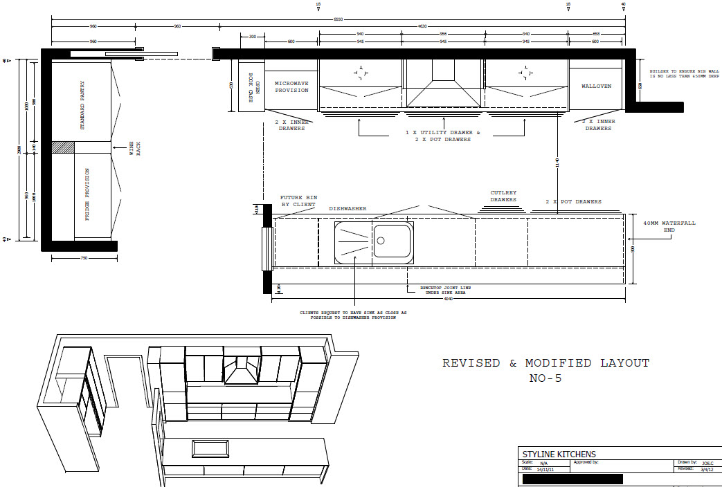

Note: The 3D image on the second page denotes a lower oven position and different drawer configuration below it. This was one of the changes we had fixed, but alas the pic wasn't updated. We will just note that it is incorrect in that image for purposes of sign-off. The rest of the plans show the right configuration.
Colour and appliance selections:
Benchtop: 40mm Caesarstone White Shimmer
Splashback: Caesarstone White Shimmer

Cupboards: Polytec Sheen Classic White (Yes, there is actually a picture underneath this text!)

Hmmmmm, maybe this pic is a better example:
 |
| http://www.polytec.com.au/files/Polytec_MELAMINE_12pp_Web.pdf |
Under-bench cupboard handles: Recessed aluminium

Pantry and microwave cupboard handles:

Microwave cupboard door: Aventos lift system
Pendant lights above the island:

Floor: Spotted Gum timber floor boards

Sink:

Tap: Phoenix Vivid Sink Mixer 220mm Gooseneck

Oven: SMEG SAP112-8
Cooktop: SMEG PSA906 GAS
Rangehood: SMEG K9399R
Dishwasher: SMEG DWAI152XT SEMI-INTEGRATED
Fridge: LG GR-L219CSL
http://www.lg.com/au/kitchen-appliances/refrigerators/LG-french-door-refrigerator-GR-L219CSL.jsp

A lot of planning has gone into this kitchen and how we will use/enjoy the space. Here is an overview of some of our choices:
- There are a lot of drawers as they are the best use of space and are easier for lifting things out of
- The recessed aluminium handles are easy on our hands and look great
- The oven and microwave positions are high
- We couldn't justify the price and inconvenience of an integrated microwave (the fascia's cost more than the appliance and aren't universal!) but we wanted a seamless look without having the microwave low-down i.e. hidden in the island. So, we decided on a microwave cupboard which allows us to save money, by using our old microwave, without compromising the look of the kitchen. We also opted for a commercial-grade door on the cupboard so that it can be larger and keep symmetry, as well as have an extra shelf for microwave covers/containers etc.
- We wanted our splashback to be Caesarstone like the bench-tops however Caesarstone is 20mm thick (glass is 6mm), so we've extended the cooktop wall by 3cm (maximum we can go without having to start doing expensive things like change cupboard depths).
- Wine rack next to fridge. Always handy.
- We will install our own bin after hand-over as well as this pantry system:

- A lot of time was spent agonising over the cupboard material and finish i.e. gloss vs sheen vs matt and createc vs melamine vs vinyl vs polyurethane. In the end we decided on a compromise and went with Polytec Sheen. This was for a number of reasons. We decided on the melamine because it appears to be the most hard-wearing (based on opinions gathered from the web as well as from our kitchen designer) and Sheen (which is like a semi-gloss) because it has the easy-wipe 'cleanability' of gloss without the huge price-tag. Also, hopefully it won't show as many finger prints as the high gloss, nor should it blind us considering the two skylights that will be angled towards our kitchen!
- And, my most favourite thing in the kitchen...the bookshelf! The perfect segue into the Study and a great way to store my myriad of cookbooks and Donna Hay magazines!!!!!! (Can you tell I'm excited?)
*Sigh* Now if only I could click my fingers and our kitchen would materialise...
Friday, March 23, 2012
Where do I start…
Apologies for the delay in posting. I was holding out until
we received the final kitchen layouts, and possibly Council Approval, however
neither has turned up. Yep, Council have had our plans since early January and
are still yet to give us a green light. What’s more, our neighbours called
hassling about when we will start building so we can have a fence installed and
when we explained that we are still waiting for Council approval, they then let
us know that they had asked Council to reject our plans. Lovely. Rather
than coming to us with their issue, they’ve potentially held us up and cost us
time and money. They feel that one of our bedroom windows will look into their
ensuite bathroom, which has frosted glass anyway, however we triple-checked the
drawings before submission so that we don’t look into anyone’s house. We don’t
want to be looking into their bathroom any more than they want us looking in! We’re
just disappointed that they went about things in an under-handed way. If they
had come to us first we could have showed them the plans relative to their house, and had they been nice but still unhappy about the window, we
would have changed it to a highlight window (an option we considered anyway).
It would have been less drama and more amicable. We’re still paying for a
temporary fence though as it is the fair thing to do.
Edit: Council finally
got back to our builder this week, and have requested that more engineering
drawings be drafted and a new site survey be ordered as they have changed the
slab classifications since our plans were drafted. So, we’re looking at another
$500 and two weeks for plans to be drawn, then more waiting while Council
deliberate. This is how I feel about that:
&^*^*&&%^$Q*#!!@#$%^&*+(@)*&!@!@(@&!%$!+!&!%^@%#$!$#@!$%#&!*@#@)#@!!!
On the bright side, no
mention of the bedroom window or neighbour complaint was made, so it looks like
that isn’t an issue.
Anyway, our kitchen plans are coming along nicely, and I
would have been able to show you but our kitchen contact decided to make more
changes than requested, which we don’t like, and so we have asked him to change
it to the exact specifications we gave. I’ll post them as soon as I get them.
Bathroom selections are also nearly finalised. Our poor
builder has been asking for them for weeks now, but it’s tough when you can’t
see the space or have weekdays off to visit showrooms, assuming they even have
the items you want to look at on display! I will post more on these soon.
In the meantime, we ordered those pendant lights for the
kitchen and they turned up today. We quickly took one out of the box and it
looks great! I will take pics when we take the other two out to check them
later.
Sorry for the sparse post but I have just started a new job
and Mick is swamped at his, so we have been spending our time working with the
spare moments taken up by house planning, weddings and other such things. This
weekend we’re heading up to Newcastle to visit family (with a possible quick
stop at Reece to look at toilets) and on the way back we’re seeing a very dear
friend who is losing a family member. It is sad moments like these that make
you realise that work and house plans, whilst important, aren’t what really
matter in the grand scheme of things...
Subscribe to:
Posts (Atom)
Subscribe To


 Posts
All Comments
Posts
All Comments